EXEPERT Updates
The Art of Retro Futurism
Retro futurism turns yesterday's vision of tomorrow into a visual language that feels both familiar and new—clean, optimistic and shared across generations.
 Akmal Alif · 7 September 2026 MYT
Every age imagines a tomorrow, but only a few visions remain vivid after the technology itself has changed. Retro futurism lives in that charged space between prediction and memory. It takes the confidence of an earlier future—bold machines, orderly systems, bright signals—and lets us see it again from the present. The result can feel unexpectedly clean and forward-looking, even while its paper grain, cassette vocabulary and broadcast colours pull us towards the past.
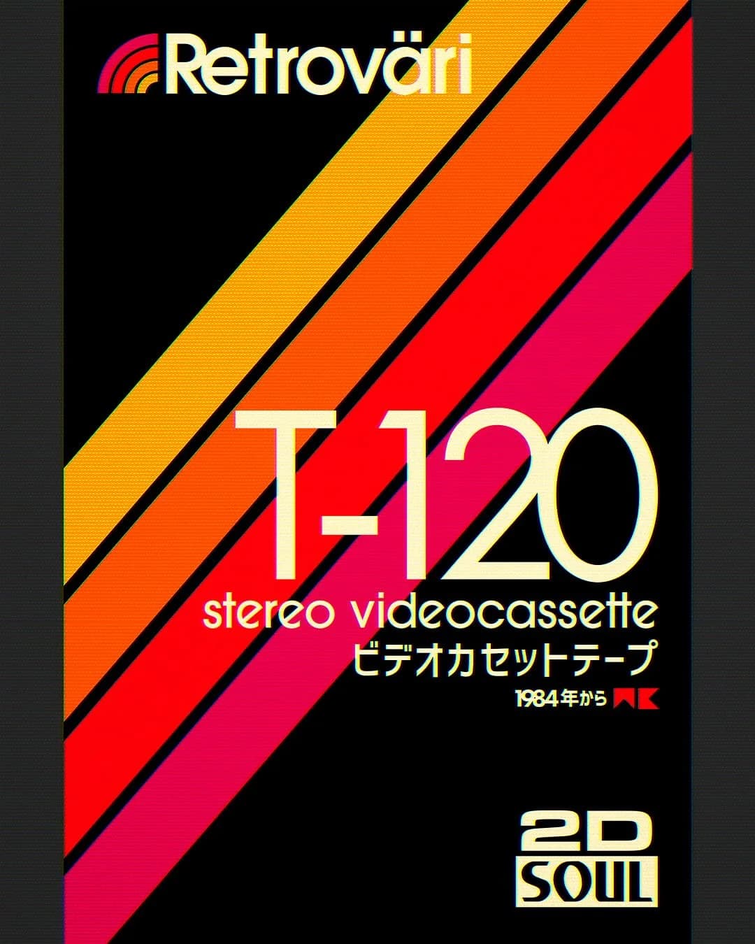
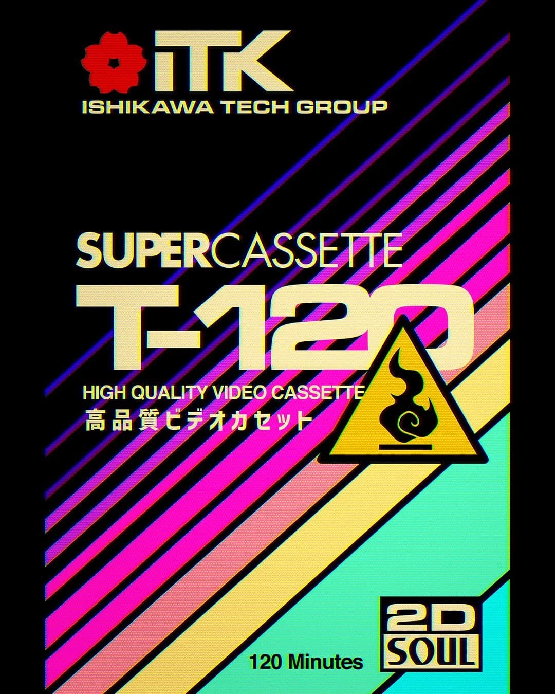
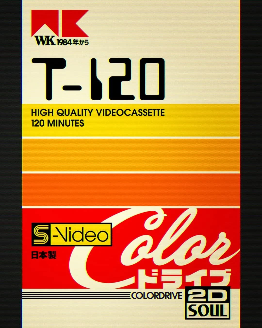
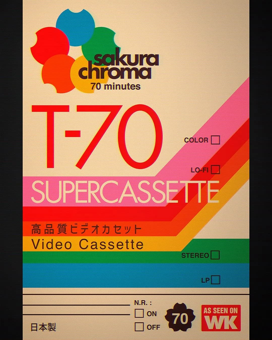
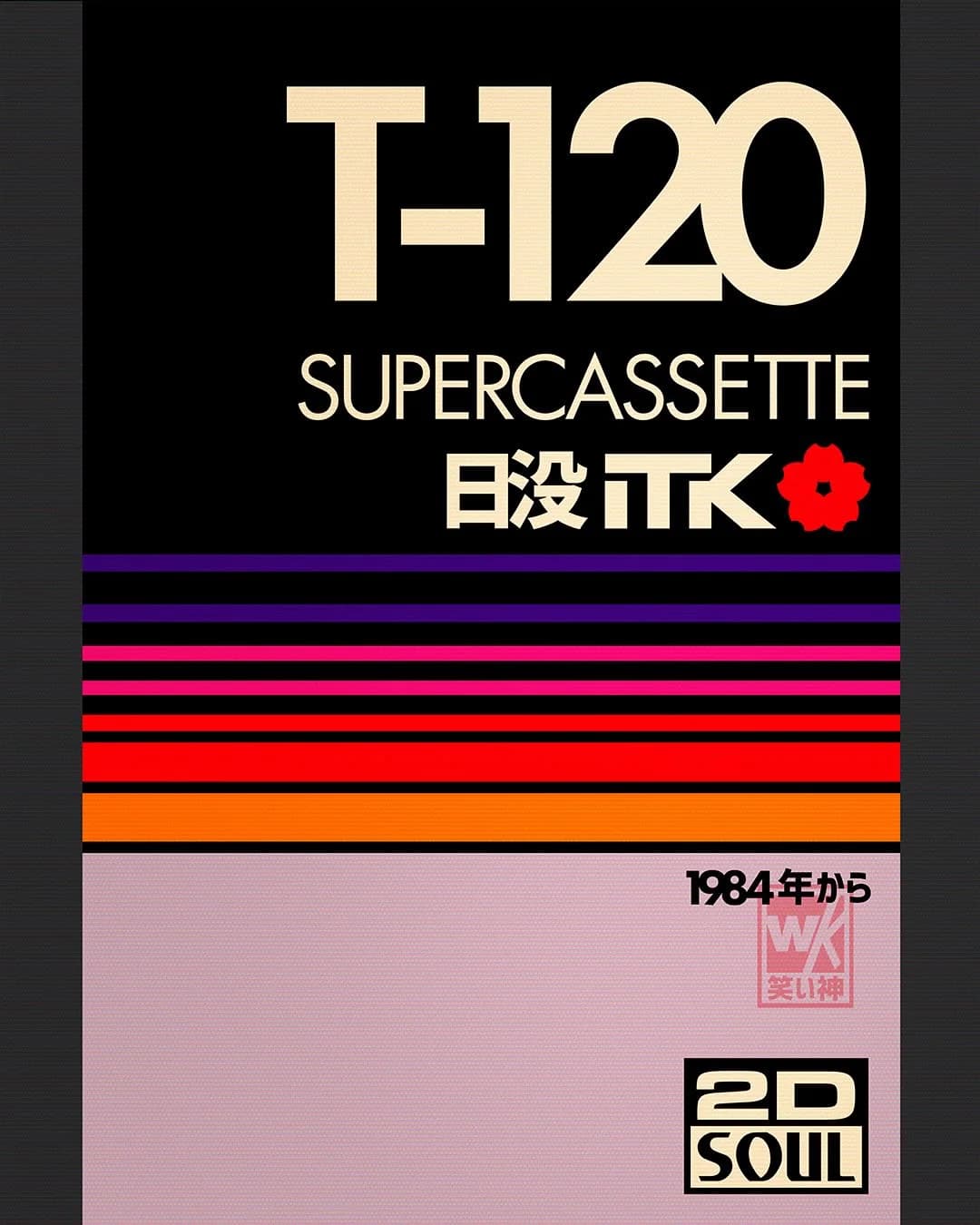
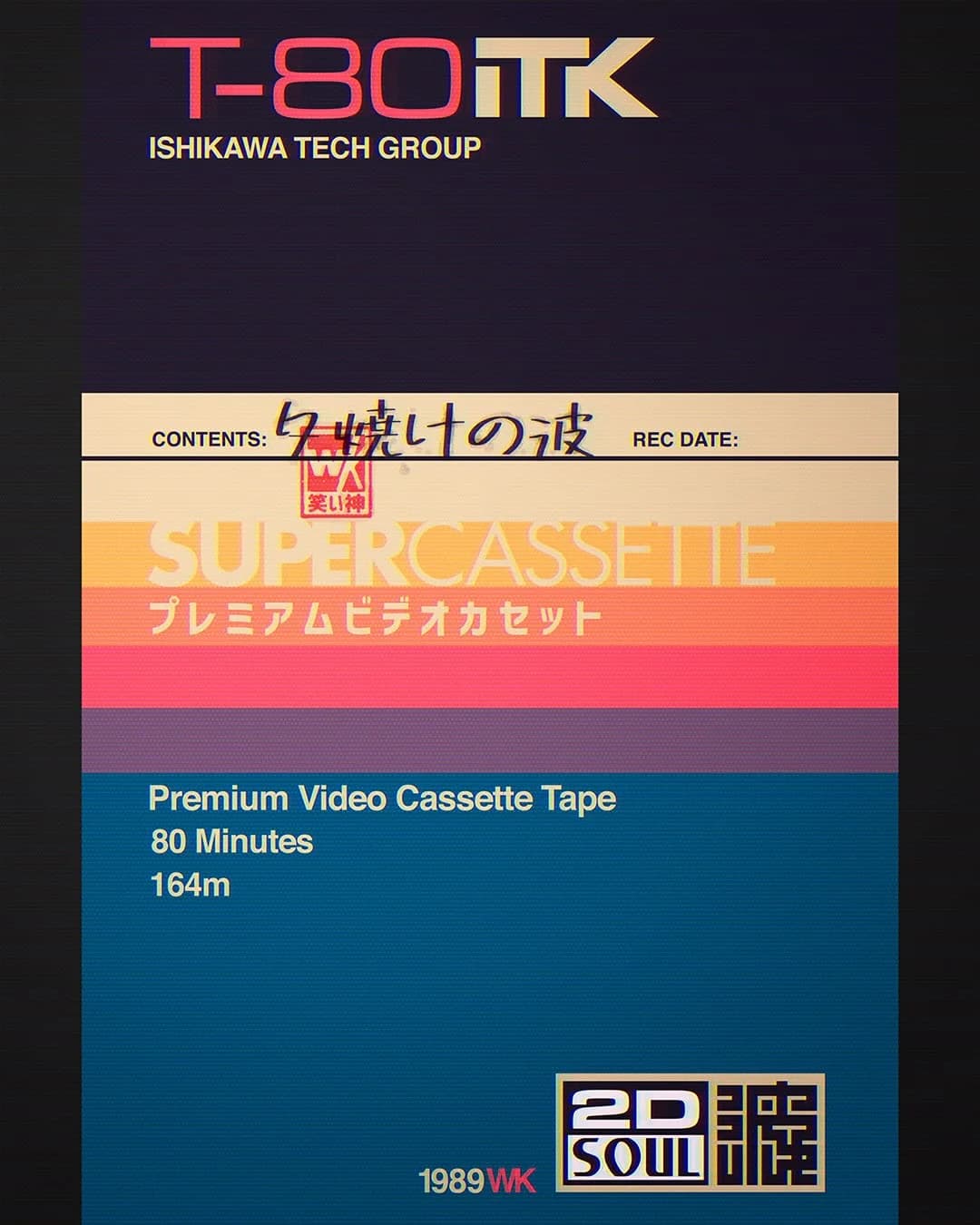
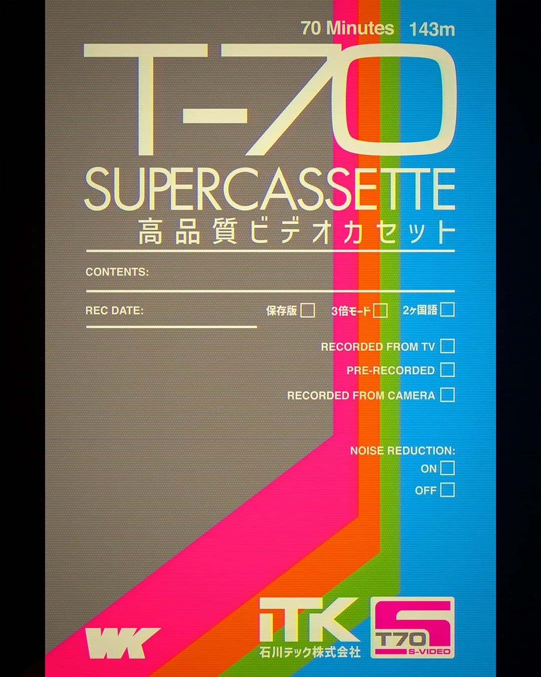
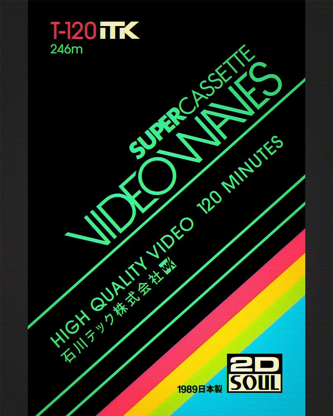
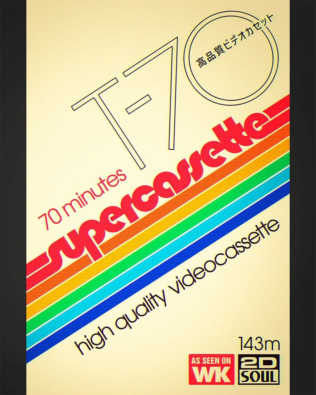
The ten works accompanying this article are contemporary cassette-futurist artworks, not authentic vintage packaging. They invent labels for an alternate history of physical media: a world of T-70, T-80 and T-120 tapes, technical markings, fictional manufacturers and optimistic colour systems. Their appeal comes from how convincingly they understand the visual logic of an era without pretending to be historical artefacts.
A future remembered, not predicted
Retro futurism is often described as yesterday’s vision of tomorrow. That framing matters because the style is less about predicting what comes next than examining what earlier generations hoped the future would become. The Next Nature Museum’s RetroFuture perspective treats past futures as material that contemporary artists and designers can revisit, reinterpret and question. The distance between then and now gives the work its emotional voltage.
In these cassette studies, the imagined future is organised, legible and physical. Numbers announce recording duration. Bands of colour suggest signals moving through a system. Japanese and English lettering share the same field, hinting at a borderless technological culture. Nothing needs to function as a real product label. Instead, each piece concentrates the feeling of a future once promised by consumer electronics: compact, capable, international and just within reach.
Artwork by @warakami_vaporwave, republished with permission.
Clean without becoming sterile
The cleanliness of this work begins with structure. Grids establish order before decoration arrives. Strong diagonals create motion without requiring animation. Oversized numerals give each composition a clear point of entry, while disciplined spacing allows dense technical details to sit around them without becoming noise. Even the most colourful pieces rely on a limited palette and an obvious information hierarchy.
That restraint is why the designs feel futuristic rather than merely busy. A black field crossed by five luminous lines can imply speed, data and transmission. A cream ground with red and yellow blocks can evoke both a control panel and a printed sleeve. The geometry does the conceptual work first; colour intensifies it. Technical typography then makes the fictional object appear governed by a system, as though every mark has a purpose.
Clean design is sometimes confused with removing character. These pieces demonstrate the opposite. Their clarity creates room for personality: a triangular bird emblem, a pixel spectrum, a flower-like cluster of circles or a dramatic run of hot-pink type. Because the underlying layout is controlled, those gestures feel decisive rather than decorative.
The warmth of technical detail
What keeps this precision from becoming sterile is the evidence of touch. Fine grain softens flat colour. Slight colour bleed recalls ink meeting paper. Cream replaces clinical white, and black often carries the uneven depth of a printed surface rather than the perfect void of a screen. These textures make the artwork feel handled, stored and rediscovered.
The vocabulary adds another layer of warmth. “Supercassette”, “stereo”, recording times and noise-reduction controls belong to an era when media declared its physical limits. A tape promised 70, 80 or 120 minutes; duration had weight. Bilingual Japanese-English lettering gives the labels the energy of imported electronics and broadcast graphics, while the fictional brand names let the artist build a world without copying a single historical package. Nostalgia here is not an applied filter. It grows from material cues, formats and constraints.
Nine cassette-futurist studies
Image 1 of 9: Eikō T120 pixel spectrum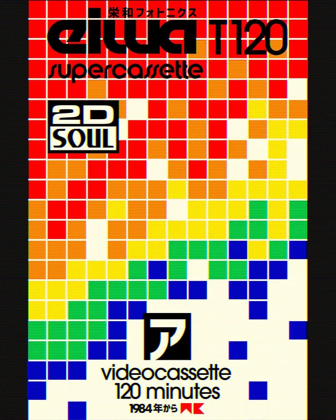
Why two generations see themselves in it
For older audiences, cassette futurism can trigger recognition before analysis. The visual language recalls recorded programmes, hi-fi catalogues, television idents and electronics shops—a time when new media arrived as an object with buttons, labels and a manual. The emotion is less about missing inconvenient technology than remembering the thrill of making the future tangible enough to hold.
Younger audiences often enter from the opposite direction. They may have little personal memory of videocassettes, yet the style feels distinctive in a landscape of frictionless screens. Grain, rigid grids and finite recording times offer texture and limits that digital interfaces usually hide. What one viewer reads as familiar, another can find unusual, intentional and refreshingly human.
That is why the work travels across generations. It does not demand a shared memory; it offers two entrances into the same image—remembrance near the source material and discovery through a new visual vocabulary. Both audiences can respond to its optimism and its vision of technology at a comprehensible scale.
What contemporary designers can borrow
The first lesson is structure before atmosphere. A nostalgic typeface or grain overlay cannot rescue a weak hierarchy. Start with the order in which information should be read, then use scale, alignment and spacing to make that order visible. The strongest works here remain understandable even if their texture is mentally removed.
The second lesson is controlled colour. Vivid palettes feel premium when each hue has a role: one establishes the field, another creates emphasis, and a smaller accent delivers surprise. Product teams can translate that discipline into design tokens for surfaces, text, borders, actions and states instead of scattering attractive colours across a screen.
Texture should be equally purposeful. Grain can distinguish an editorial feature or launch moment, but it should never interfere with text contrast or controls. Diagonals can energise a poster while a working interface still needs predictable reading order, keyboard focus and comfortable targets. Nostalgia and accessibility can coexist when decoration supports the message. The labels also offer a useful model by naming durations, modes and formats; modern products should be just as clear about system status, meaningful limits and feedback.
A bridge rather than a retreat
Retro futurism endures because it does more than reproduce a decade. It edits the past, retaining its optimism, graphic discipline and tactile pleasure, then recombines those qualities for the present. Its best work acknowledges that yesterday’s future never arrived exactly as advertised—and finds creative possibility in the gap.
These studies turn that gap into shared visual space. Older viewers can recognise the physical-media world beneath the invention; younger viewers can discover an alternative to weightless digital sameness. Clean geometry keeps the work immediate and printed texture keeps it intimate. Nostalgia becomes not a retreat, but a bridge through which different generations can imagine the future together.