EXEPERT Updates
Premium Color Palettes EXEPERT Recommends for Websites and UI/UX Design
Nineteen premium palettes—and a practical system for turning them into accessible, purposeful colour roles for websites, products and design systems.
 Akmal Alif · 7 September 2026 MYT
A polished interface rarely comes from adding more colour. It comes from choosing a small set of colours that know exactly what they are doing. A premium palette gives every screen a clear rhythm: a quiet background, a readable surface, a confident action colour, restrained accents and enough contrast to make the hierarchy obvious at a glance.
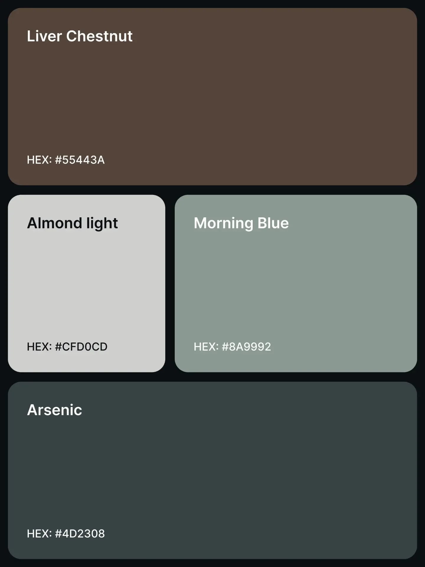
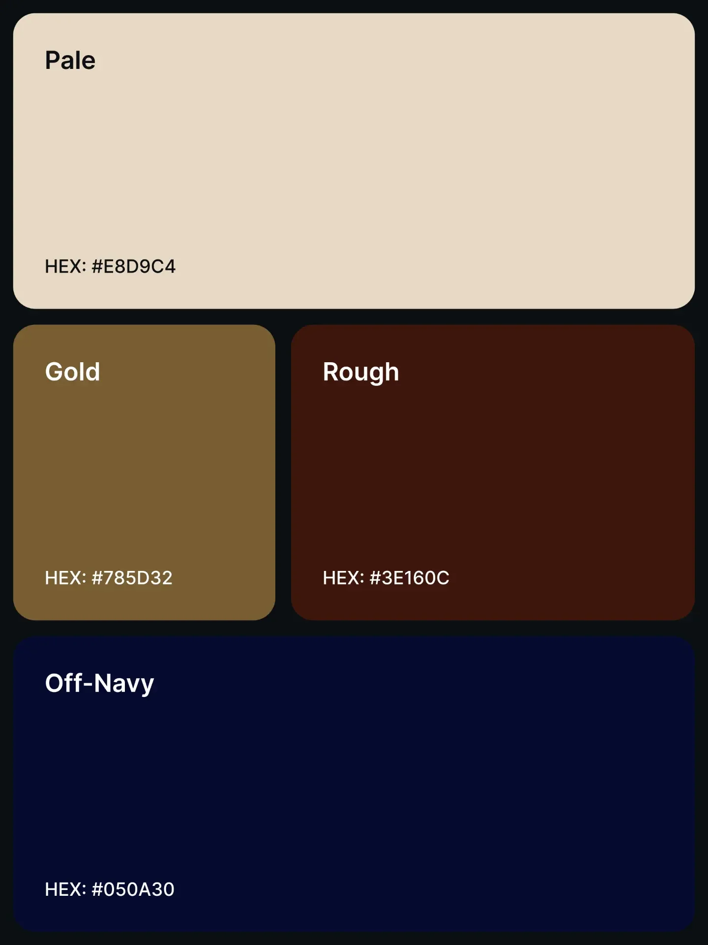
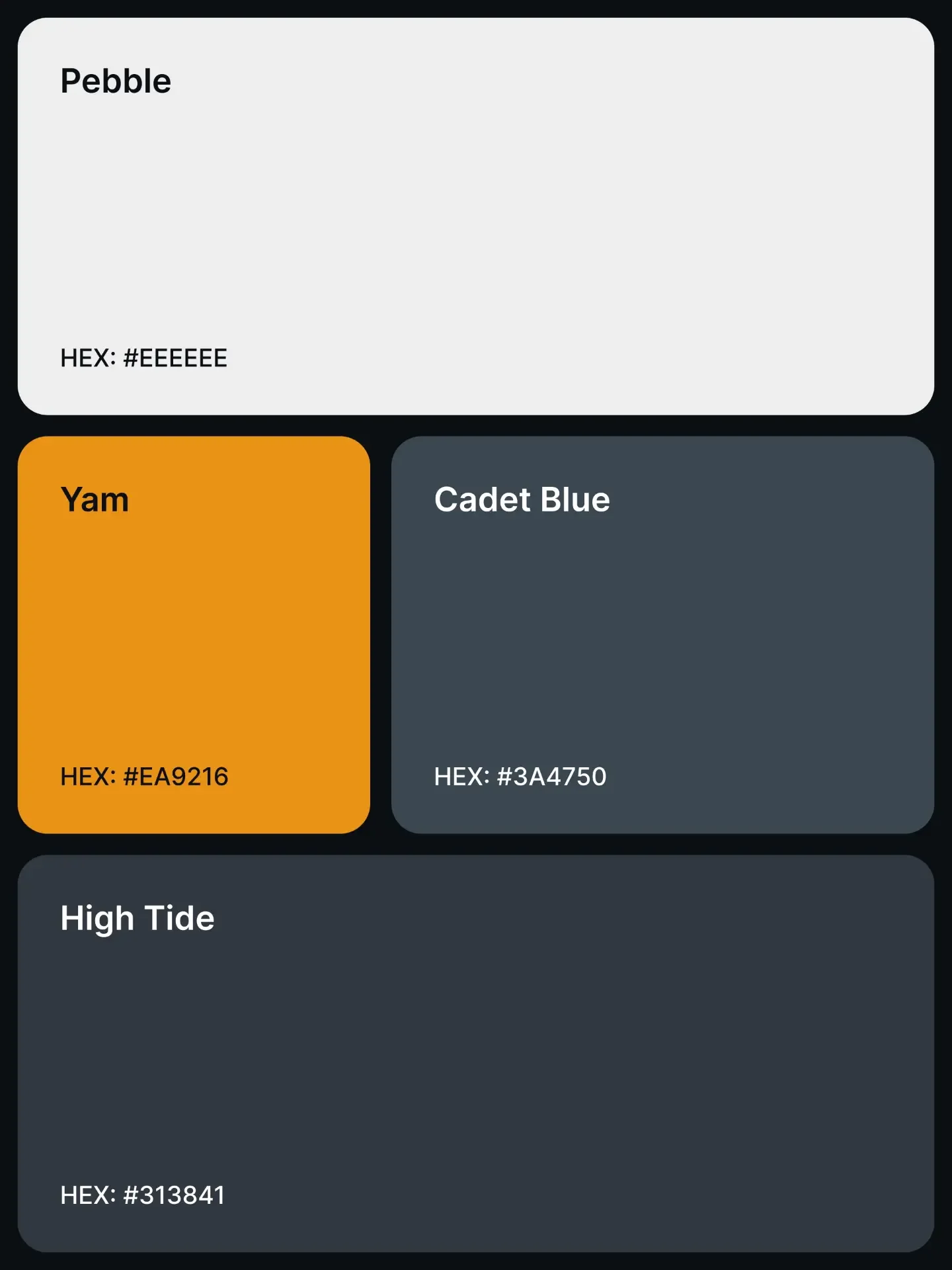
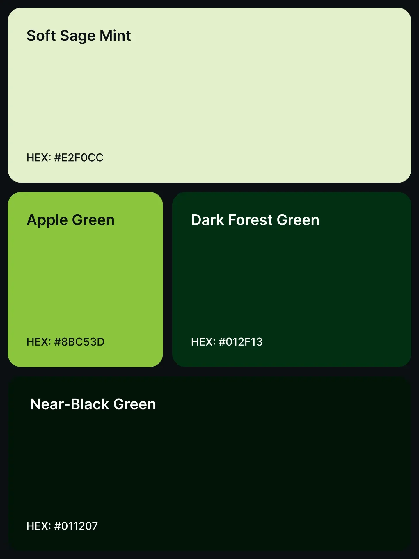
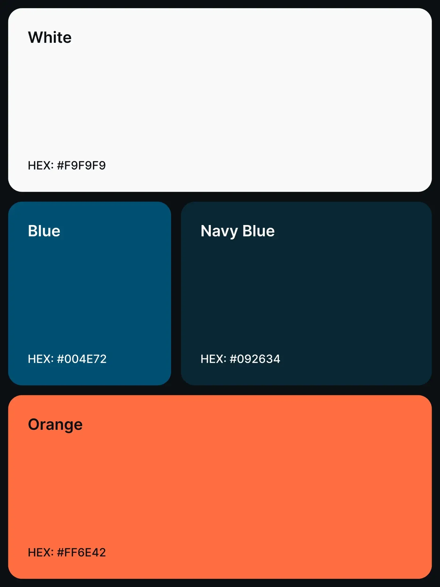
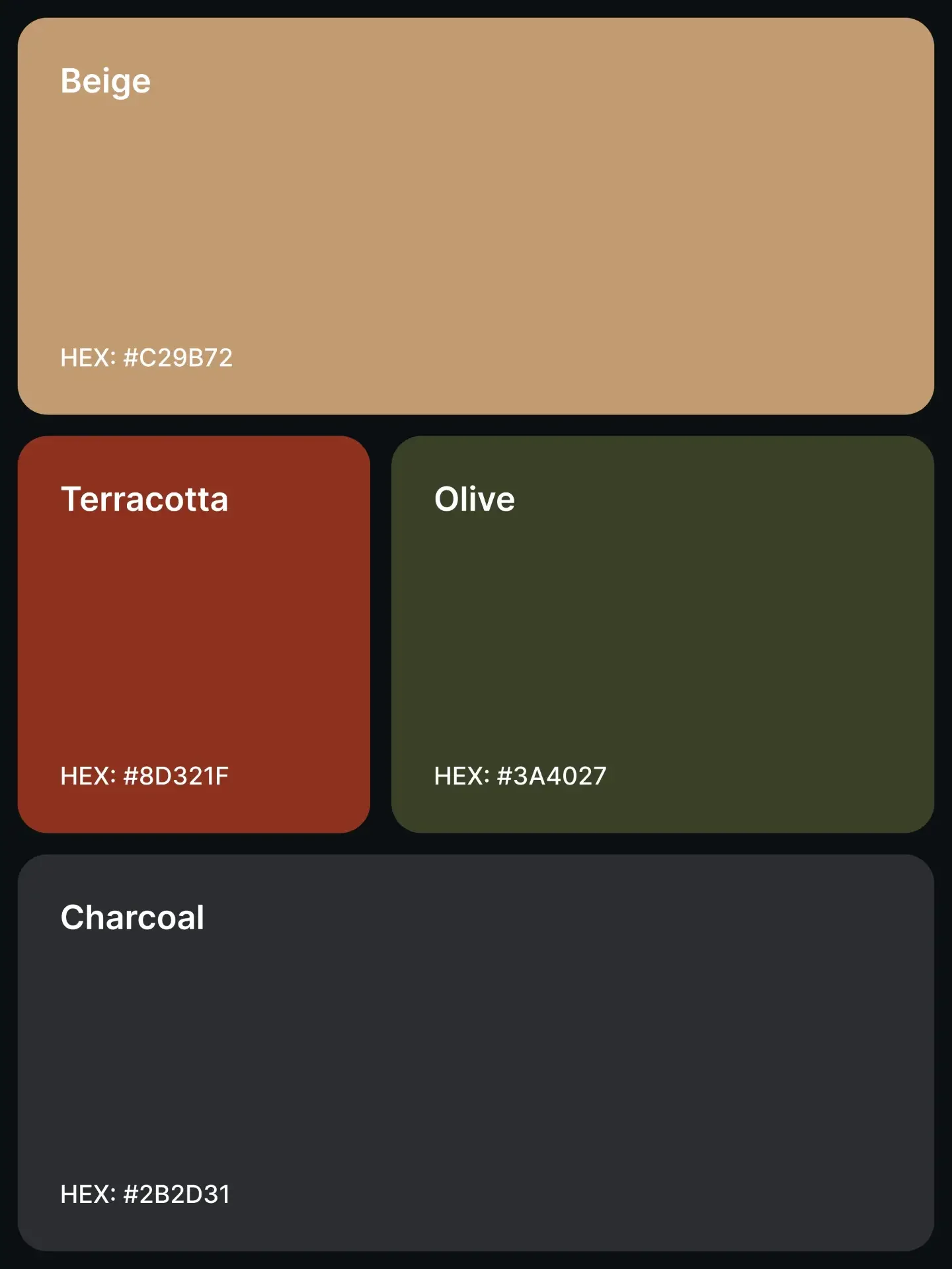
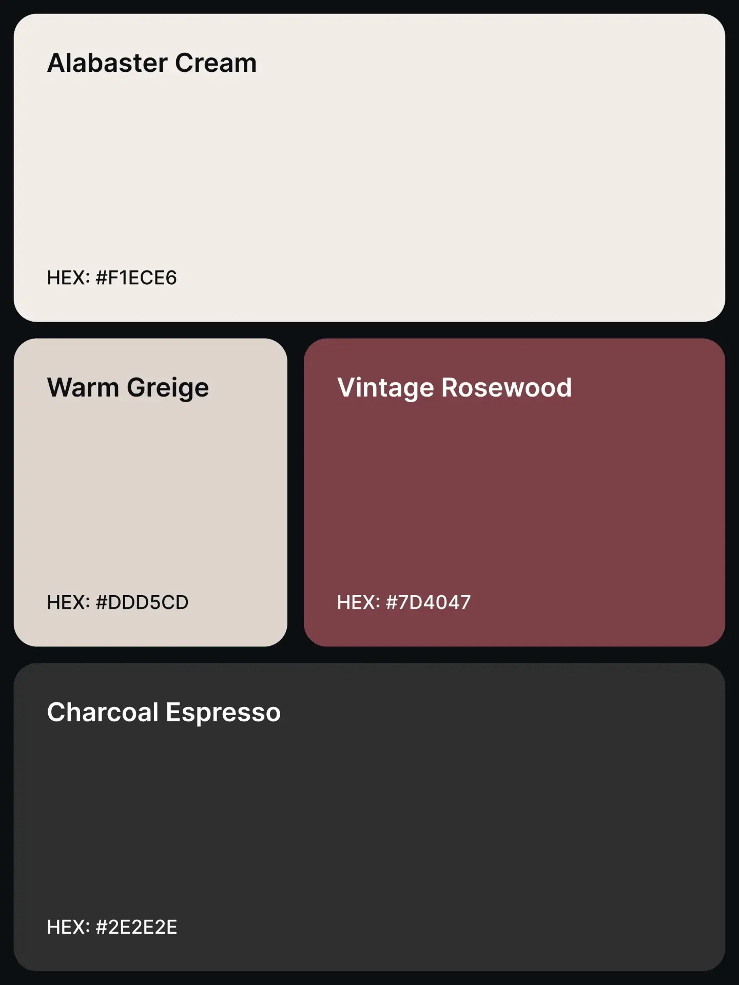
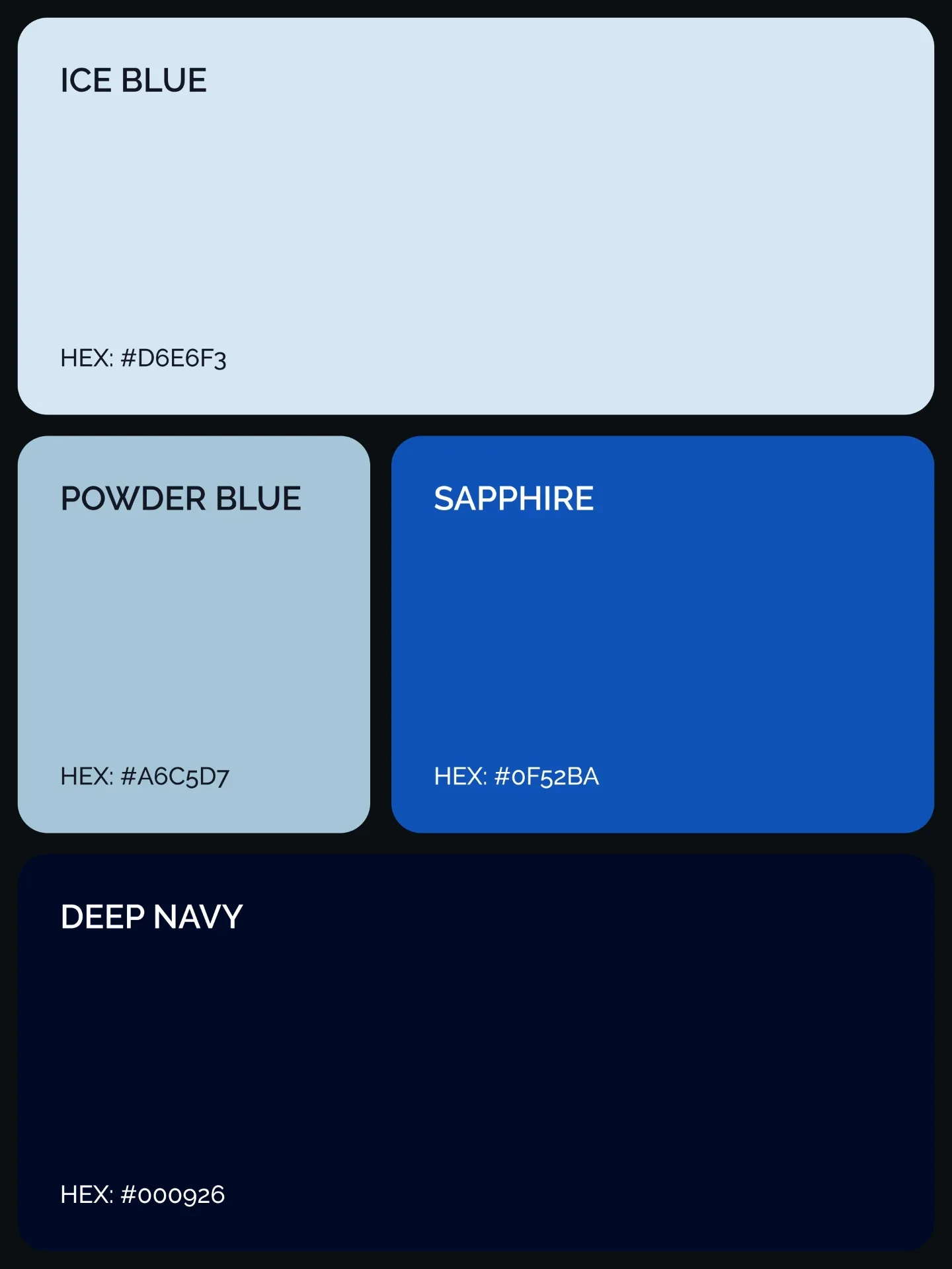
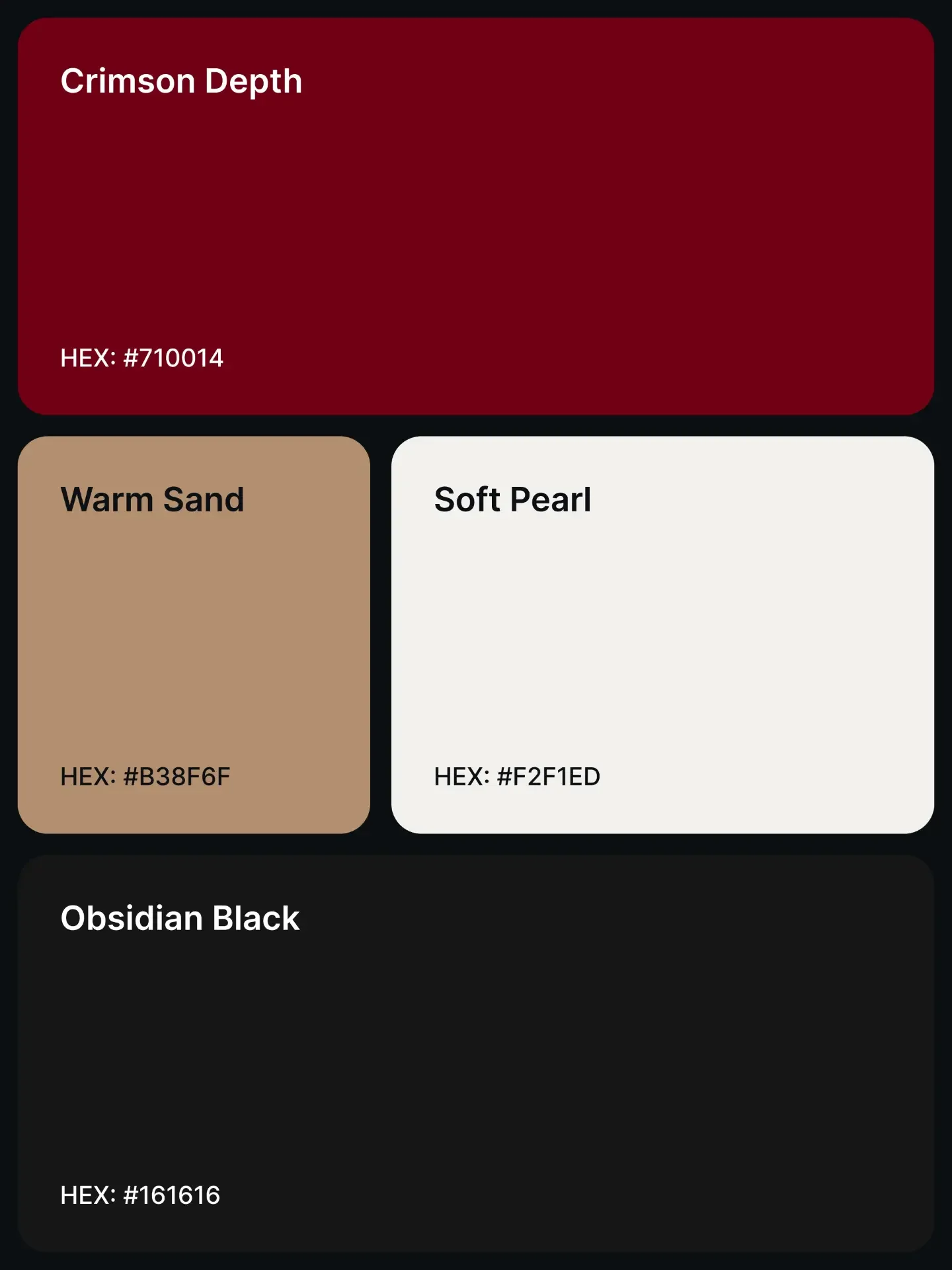
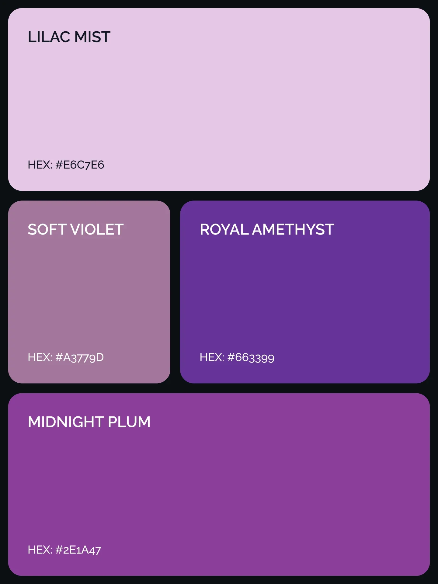
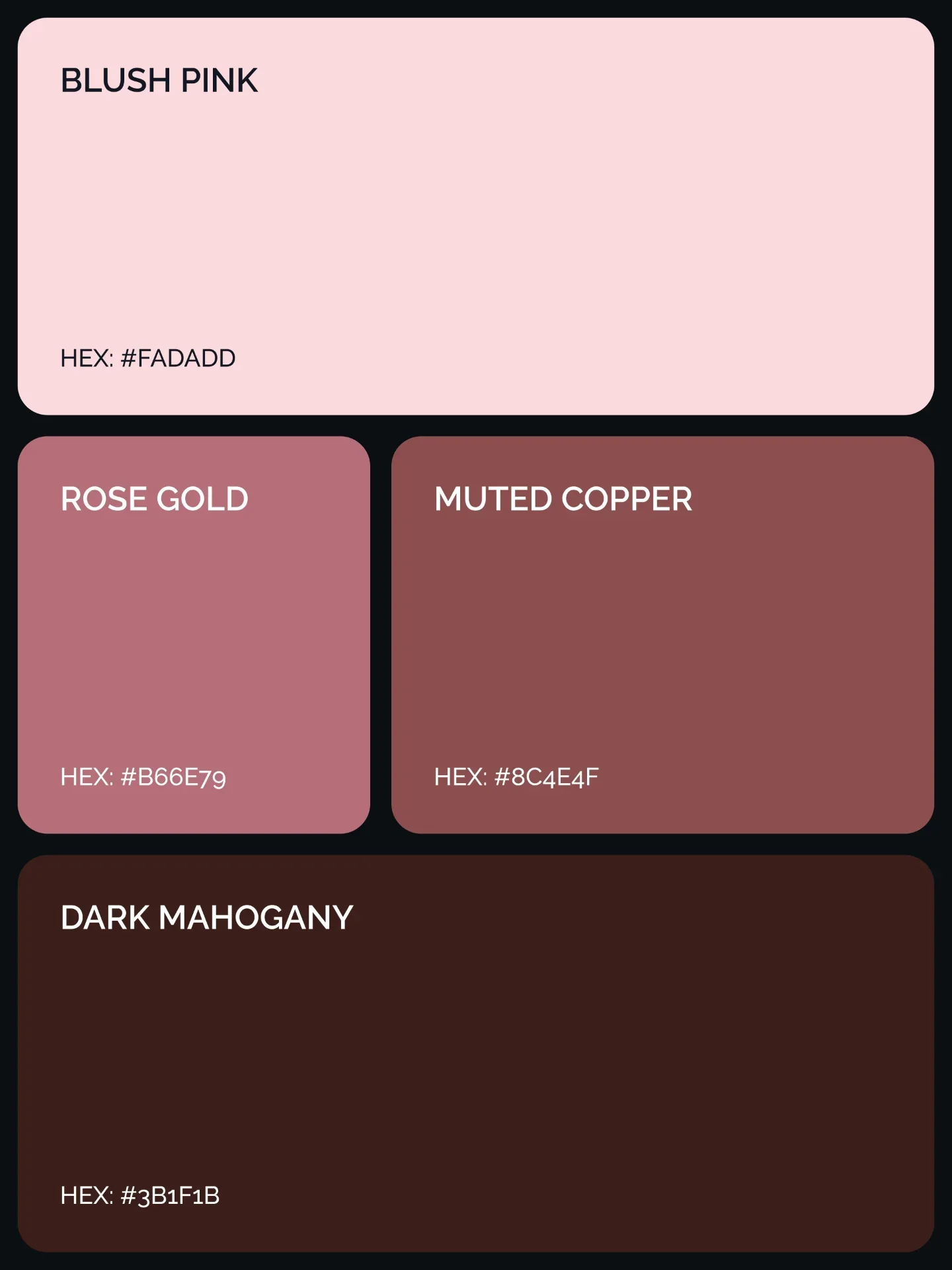
The nineteen palettes in the showcase below are starting points EXEPERT recommends for websites and UI/UX work. They move from warm editorial neutrals and heritage greens to crisp blues, expressive purples and high-energy reds. The value is not in copying every swatch into one screen. It is in selecting a mood, assigning roles and testing the resulting system in real components.
Premium is a system, not a finish
“Premium” should not mean gold gradients, low-contrast grey text or decoration everywhere. The strongest premium interfaces often feel calm. They use space generously, keep surfaces consistent and introduce saturation only where attention is useful. Colour supports that discipline. A warm off-white can make a reading experience feel considered; a deep navy can give a financial product authority; a muted green can make a wellness product feel grounded without becoming predictable.
What makes the result feel expensive is control. Repeated decisions—one border tone, one primary action, one family of neutrals—build more trust than a collection of dramatic but unrelated effects.
Assign every colour a job
Begin with roles instead of swatches. Most product interfaces need a canvas, a raised surface, primary and secondary text, a border, a primary action and a small set of semantic colours for success, warning and error. A four-colour inspiration palette will not cover all of those roles by itself, and it should not have to.
Choose the lightest or darkest colour as the canvas, then create nearby neutral steps for surfaces and dividers. Reserve the most recognisable hue for the action users should notice first. A second accent can support charts, badges or selected states, but it should not compete with the primary action. Semantic feedback colours must remain understandable on their own terms; do not force a fashionable accent to perform every job.
Build hierarchy before decoration
Premium visual hierarchy depends on contrast in more than one sense. There is contrast of light and dark, but also contrast of scale, spacing, weight and density. If every card has a coloured border, every heading uses the accent and every icon sits inside a tinted circle, nothing feels special.
Use the strongest contrast for the page title, the main task and the primary call to action. Let supporting copy and secondary controls step back, while still remaining readable. Large colour fields work well for hero moments or section changes; small, saturated marks are better for status and interaction. This creates a deliberate path through the interface instead of asking colour to shout from every corner.
Turn the palette into design tokens
Once the direction feels right, translate visual names into functional tokens. Names such as cream, sage or sapphire describe appearance, but tokens such as background, surface, text-primary, border-subtle and action-primary describe intent. Intent survives redesigns.
Build a small tonal scale around the chosen colours rather than inventing a different hex value for every component. Then map component tokens—button background, focus ring, input border, selected tab—to the functional layer. This makes light and dark themes easier to maintain, keeps hover and disabled states coherent and gives designers and engineers the same language. Document each token with examples and contrast expectations so the system remains useful after the launch screen is approved.
Match the mood to the product
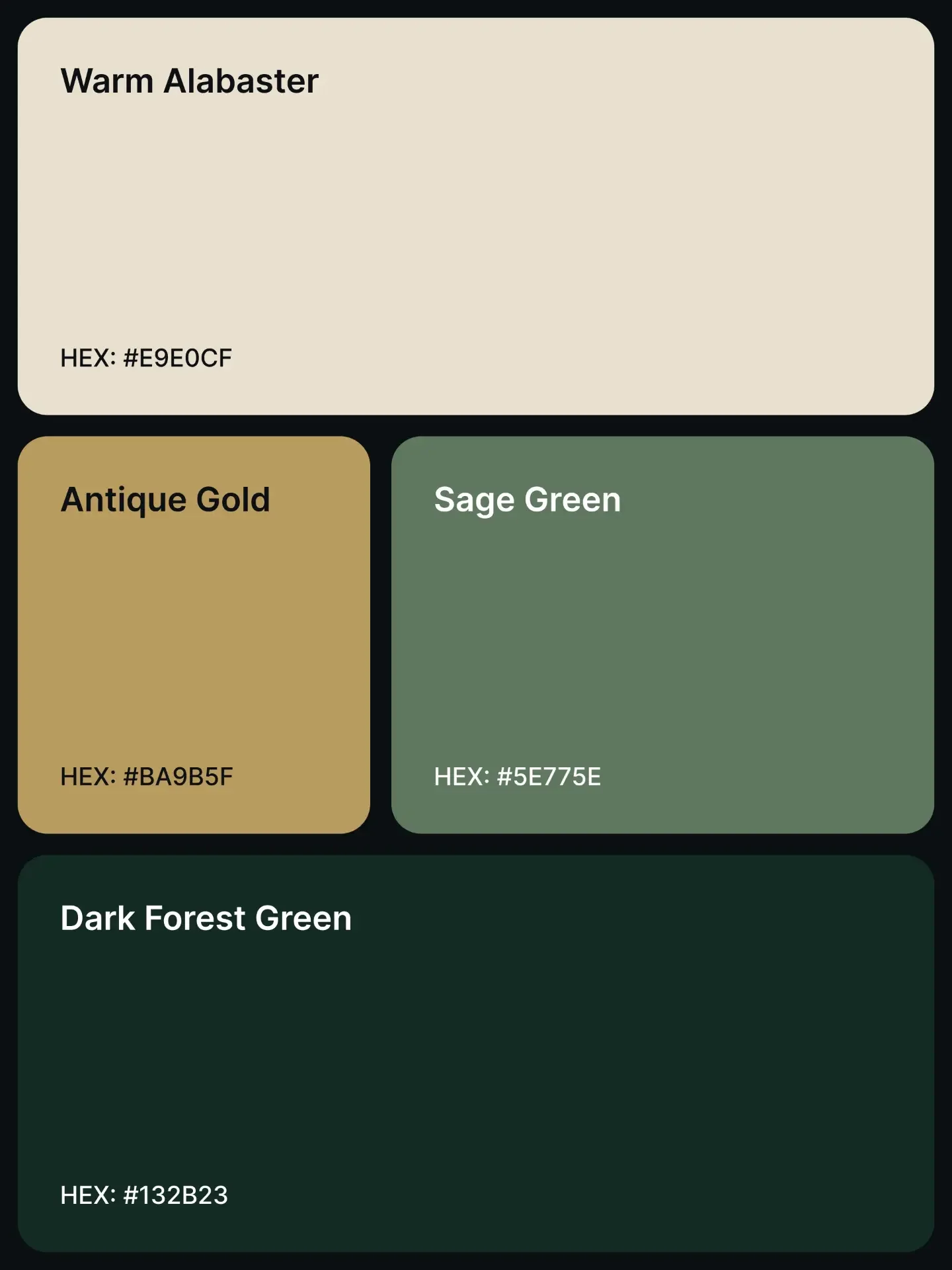
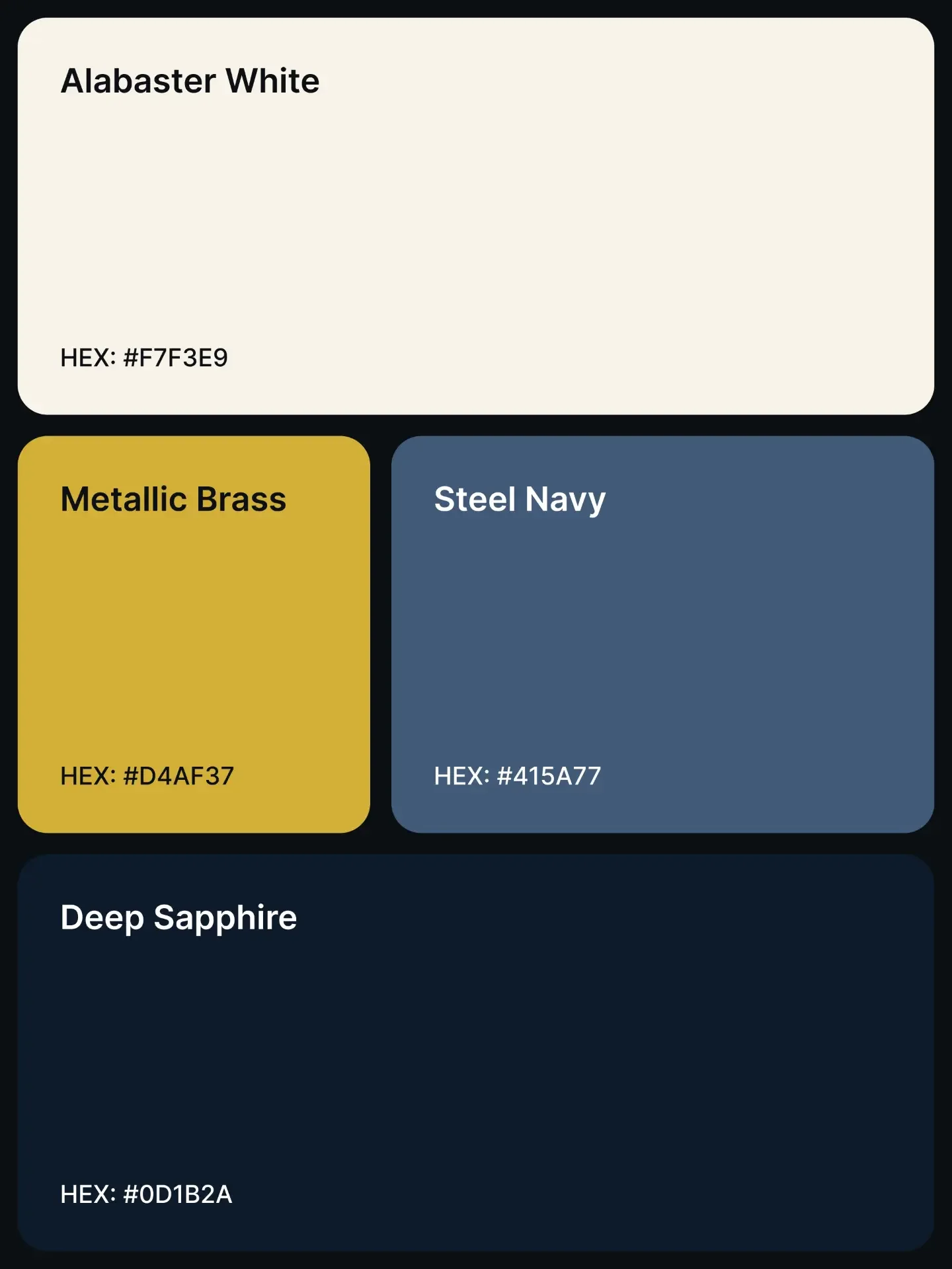
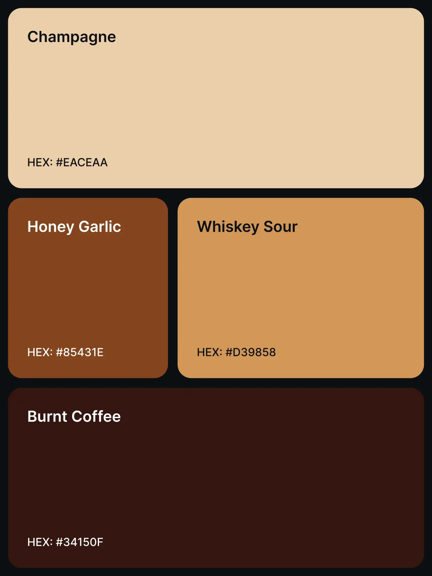
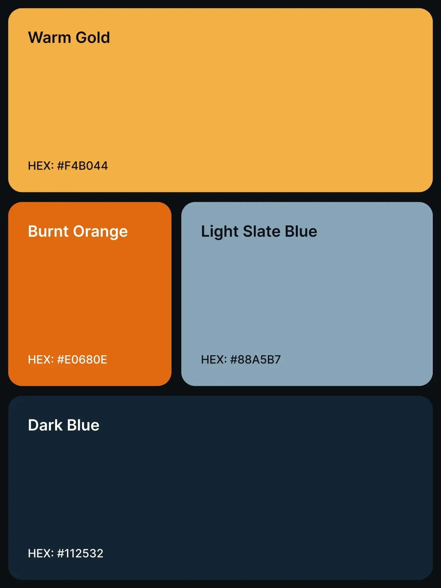
Warm alabaster, antique gold and forest green suit hospitality, architecture, premium retail and editorial portfolios because they feel tactile and established. Champagne, whiskey and coffee tones can give food, craft and lifestyle brands warmth without relying on bright orange everywhere. Steel navy, powder blue and deep sapphire are natural fits for B2B software, finance and technical tools where clarity and confidence matter.
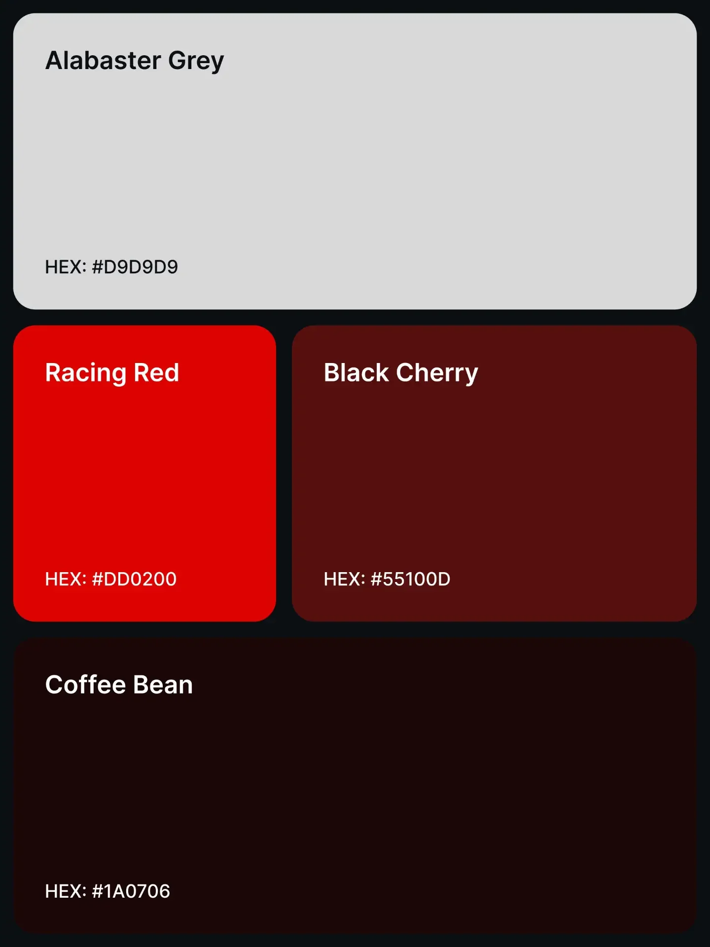
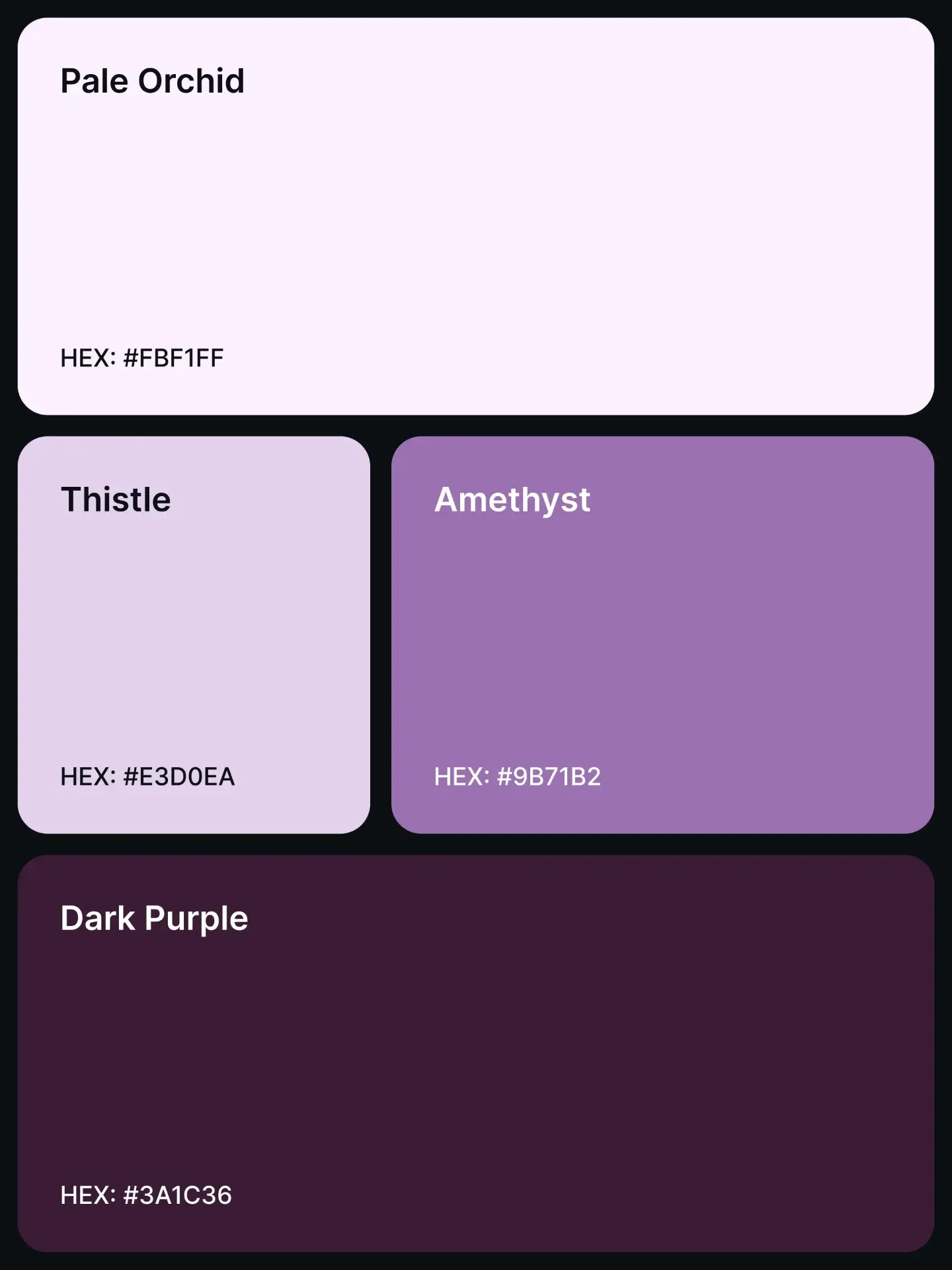
Muted rose, lilac and plum combinations can feel expressive and cultured for beauty, fashion or creative products. Racing red and black cherry bring urgency to automotive, sport and entertainment experiences, while mint and apple green can make climate, health or food products feel fresh. These are associations, not rules. Brand voice, imagery, typography and audience expectations can completely change how the same colour reads.
Use the showcase as a starting point
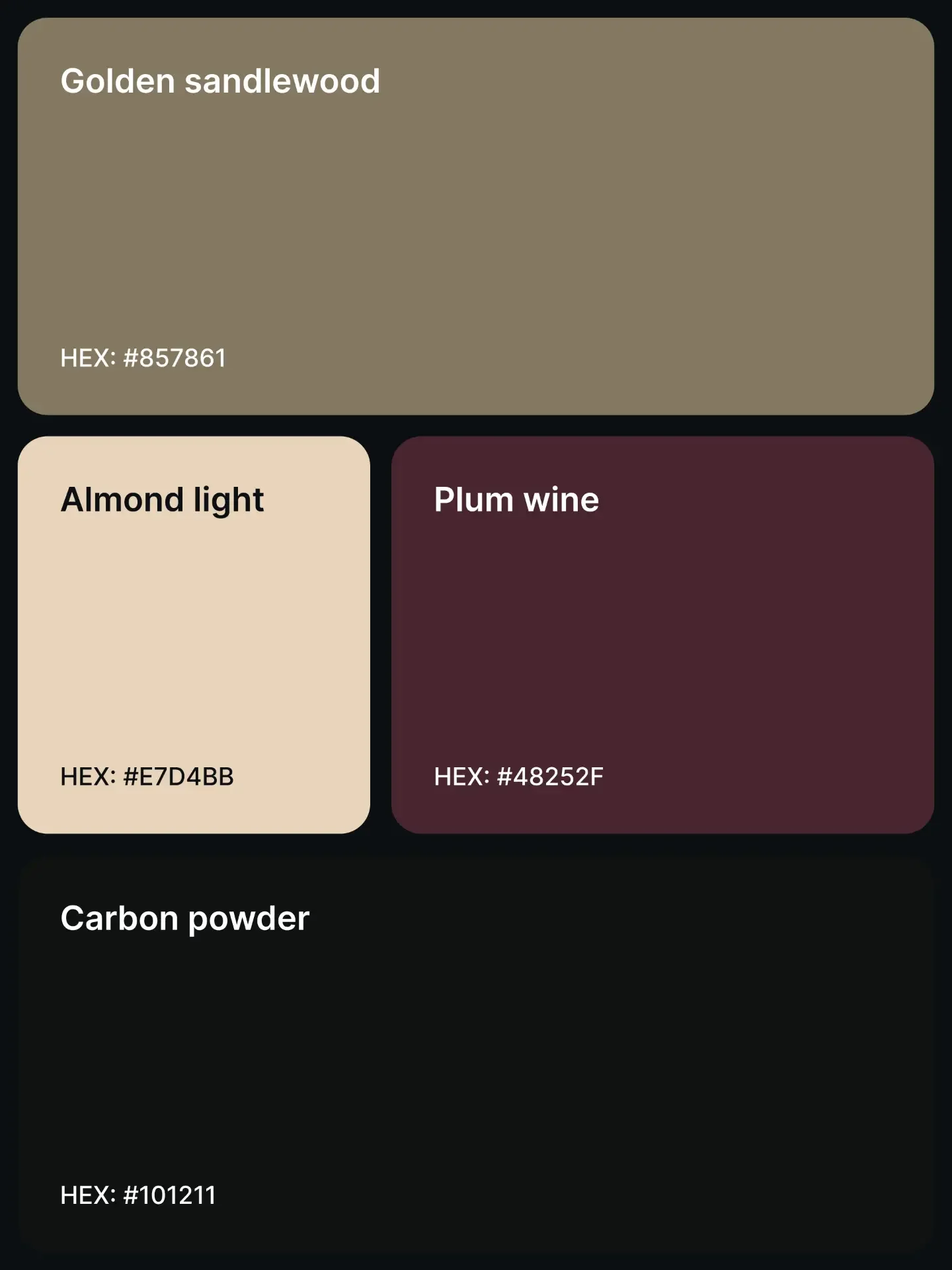
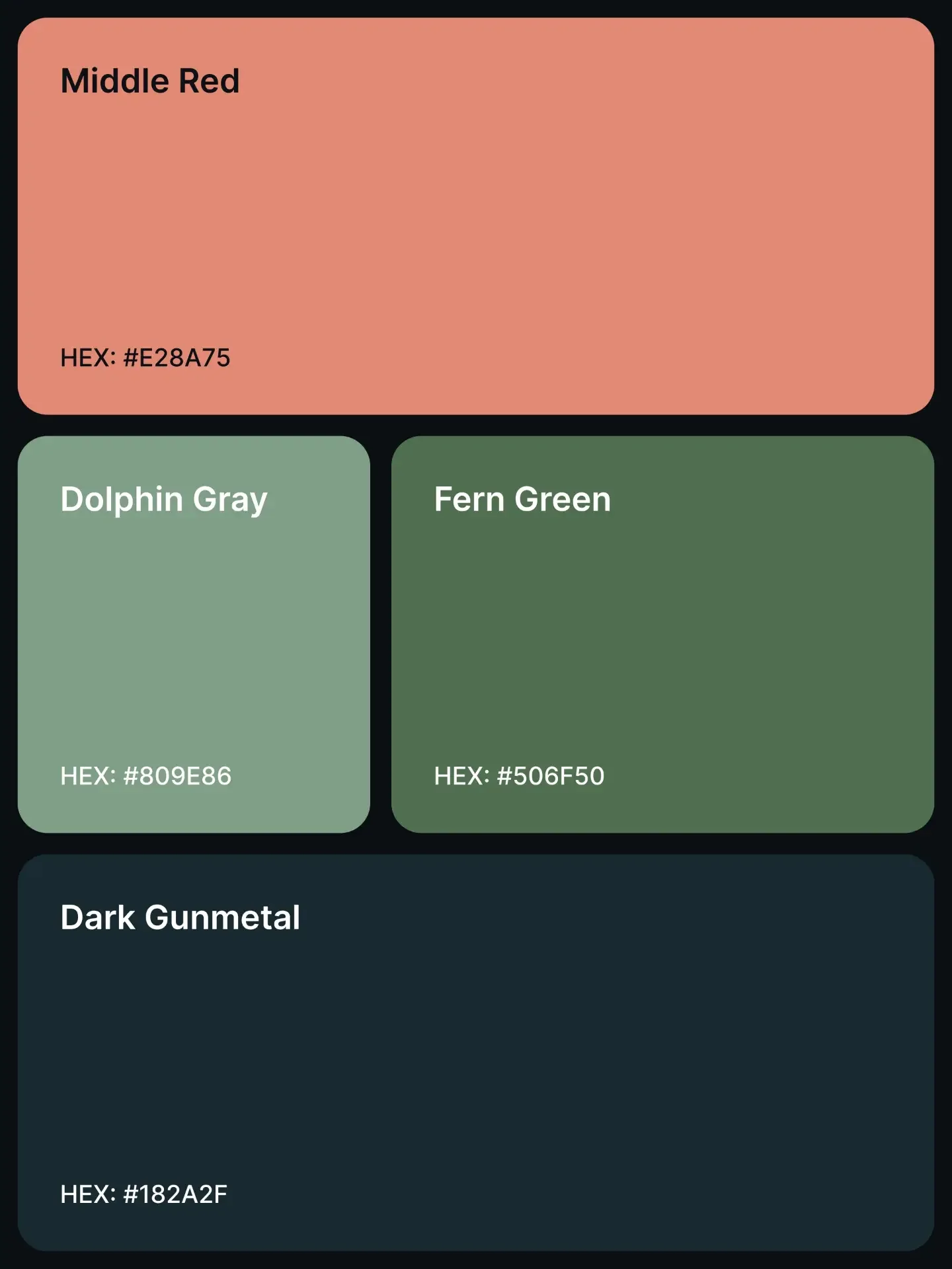
Review the palettes one slide at a time and notice the relationship between the light anchor, mid-tone accents and darkest foundation. Shortlist two or three directions, then apply each one to the same realistic screen: navigation, form fields, a data-heavy card, an error state and a primary action. Comparing complete states is more revealing than comparing swatches.
Test the palette with real photography, long headlines and dense content. A combination that looks elegant in a poster can become tiring across a dashboard. Keep the winning direction, adjust the tonal steps and record why each role exists.
Accessibility is part of the palette
A palette is not ready because its colours look harmonious. It is ready when people can read, navigate and understand the interface. Under WCAG 2.2, ordinary text needs a contrast ratio of at least 4.5:1 against its background. Large text needs at least 3:1. Check the actual foreground and background pair used in the component, including hover, disabled and selected states; a hex value is not accessible in isolation.
Never use colour as the only information cue. Pair an error colour with clear text and an icon, pair chart colours with labels or patterns, and make selected states visible through shape, weight or position as well as hue. Provide a visible keyboard focus indicator and test in bright light, dark mode, greyscale and common colour-vision simulations. Accessibility does not flatten a premium system. It forces the hierarchy to become more precise.
A practical EXEPERT workflow
Start with one palette and one representative screen. Assign functional tokens, build the neutral steps, then create interaction and semantic states. Check contrast before polishing shadows or motion. Review the system on mobile and desktop, with short and long content, and with both mouse and keyboard navigation. Finally, remove any colour that does not have a clear job.
The goal is a palette that people notice as a feeling before they notice it as a set of hex codes: confident, calm, energetic, warm or exact. That is what turns attractive colours into a durable interface system.
19 premium palettes to explore
Image 1 of 19: Warm Alabaster · Antique Gold · Sage Green · Dark Forest Green