
Machine Learning
Watching a Neural Network Learn to See: CNN Kernels Training on MNIST
A wordless 2018 video shows a small convolutional network's filters turning from random noise into edge and stroke detectors while it learns MNIST. What each panel means, why edges emerge, why deeper layers are harder to read, and the limits of the picture.
 Akmal Alif · 9 October 2026 MYT
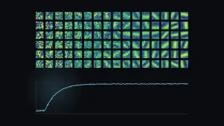
Some of the clearest explanations of machine learning have no words at all. In 2018 a YouTube creator named Jonathan trained a small convolutional neural network on handwritten digits and recorded its filters changing, step by step, for two and a half minutes (Jonathan, 2018). The video has a few thousand views. It deserves more, because it shows one of the field's central ideas happening in front of you.
The video is embedded below. It has no narration, so this post explains what you are looking at. The timestamps jump to the matching moment.
The four panels
The video's description explains the layout:
The input batch. On the left are the digits the network saw in its latest training step. Green digits were classified correctly, red ones were missed. Jonathan notes this is only an indication, not the measure of accuracy.
The test-set curve. Next is a curve of the network's performance on the separate test set against training steps. The description calls it average error. The plotted line climbs towards one, so it reads as accuracy.
First-layer kernels. A grid of the small filters in the first convolutional layer.
Second-layer kernels. The second layer's filters, smoothed with a Gaussian blur so they are easier to see.
The network was built in TensorFlow. MNIST, the dataset, is the classic benchmark of 28-by-28 grayscale handwritten digits, with 60,000 training images and 10,000 test images (LeCun et al., 1998).
What happens
At the start the first-layer kernels are speckled noise, the random values every network begins with. The test curve hovers around one in ten, which is chance for ten digits (watch from 0:00).
Within the first twenty seconds of video, a few hundred training steps, the curve shoots up. By then most of the digits on the left have turned green (watch from 0:20).
The rest of the video is refinement. The curve flattens into a long, slightly noisy plateau near the top. The kernels keep sharpening into smooth bands of light and dark at different angles (watch from 1:00). By the end the first layer is a set of oriented stroke and edge detectors, and the blurred second layer shows larger, curved structures (watch from 2:20).
Why the filters end up looking like edges
A convolutional layer slides each small kernel across the image and records how strongly every patch matches it. The same kernel is reused at every position. This weight sharing is why convolutional networks need far fewer parameters than a fully connected network and why they are good at images: a stroke means the same thing wherever it appears.
Nothing in the code tells the network to look for edges. Training only adjusts the kernel values to reduce the classification error. Edges and strokes emerge because they are the most useful first step for telling a 1 from a 7, or a 3 from an 8.
This is the result LeCun and colleagues built on in the 1990s with gradient-based training of convolutional networks for document recognition (LeCun et al., 1998). It reappeared at much larger scale in 2012, when the first-layer filters of the ImageNet network AlexNet were shown as a grid of oriented edges and colour blobs (Krizhevsky et al., 2017).
Why the second layer is harder to read
The second layer's kernels do not operate on pixels. They operate on the first layer's outputs, so their raw values are hard to interpret by eye. That is why Jonathan blurred them, and why researchers developed other ways to see what deeper layers respond to.
Zeiler and Fergus (2014) projected activations back into image space to show which input patterns each unit detects. Later work on feature visualisation optimises an input image to excite a chosen unit (Olah et al., 2017). Both reveal a hierarchy: edges, then textures and parts, then whole objects.
What to take from it, and what not to
The video is a good mental model with honest limits:
Learning is shaping filters. Gradient descent does not memorise digits; it reshapes small reusable detectors until they are useful.
Fast early gains, slow polishing. The steep curve followed by a long plateau is typical. Most of the easy structure is learned quickly, and the last few percentage points take most of the time.
MNIST is easy. A small network reaches high accuracy in minutes. Real images, noise and unusual handwriting are far harder, so do not read the plateau as "vision solved".
Seeing filters is not explaining decisions. A grid of edge detectors tells you what the first layer computes. It does not tell you why the network labelled a particular digit a 9.
If you are learning machine learning, rebuild this experiment yourself. A two-layer network on MNIST trains on a laptop. Plotting the kernels every few hundred steps will teach you more than another diagram of a convolution.
References
Jonathan. (2018, May 13). Convolutional neural network kernels during training on MNIST dataset [Video]. YouTube. https://www.youtube.com/watch?v=VUkFo6IXMJc
Krizhevsky, A., Sutskever, I., & Hinton, G. E. (2017). ImageNet classification with deep convolutional neural networks. Communications of the ACM, 60(6), 84–90. https://doi.org/10.1145/3065386
LeCun, Y., Bottou, L., Bengio, Y., & Haffner, P. (1998). Gradient-based learning applied to document recognition. Proceedings of the IEEE, 86(11), 2278–2324. https://doi.org/10.1109/5.726791
Olah, C., Mordvintsev, A., & Schubert, L. (2017). Feature visualization. Distill, 2(11). https://doi.org/10.23915/distill.00007
Zeiler, M. D., & Fergus, R. (2014). Visualizing and understanding convolutional networks. In D. Fleet, T. Pajdla, B. Schiele, & T. Tuytelaars (Eds.), Computer Vision – ECCV 2014 (pp. 818–833). Springer. https://doi.org/10.1007/978-3-319-10590-1_53